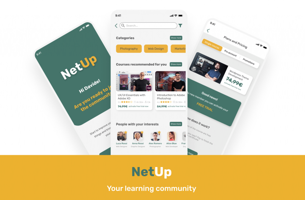
My goal for this project was to launch a new e-learning app, on both iOS and Android that could compete in the existing market and generate revenue.
All this in just 5 days!!
Individual
5 days (Ironhack Bootcamp)
To reach this goal I focused my research in two main steps:
I interviewed 6 potential users, all between 25 and 40 years old, currently working as freelancers or employees of technology companies, in Italy, Spain or England
I also wanted to study the existing market and products, so I analyzed 10 competitors including Domestika, Udemy, Coursea, LinkedIn Learning and more

All the research process was very useful and helped me to define who my users really were, what problems they had and most important how to solve them
The users that I interviewed made me realize that the existing product in the market were unable to meet their needs properly. These are the problems they point out
Customization and interaction in the existing products are almost inexistent
The users try to improve their skills or learn new ones but at the end of the process they really don’t know how to show their skills to the others
The final goal of the users is to find new clients and meet other professionals with the same interests to do networking. None of the existing apps allow them to do so
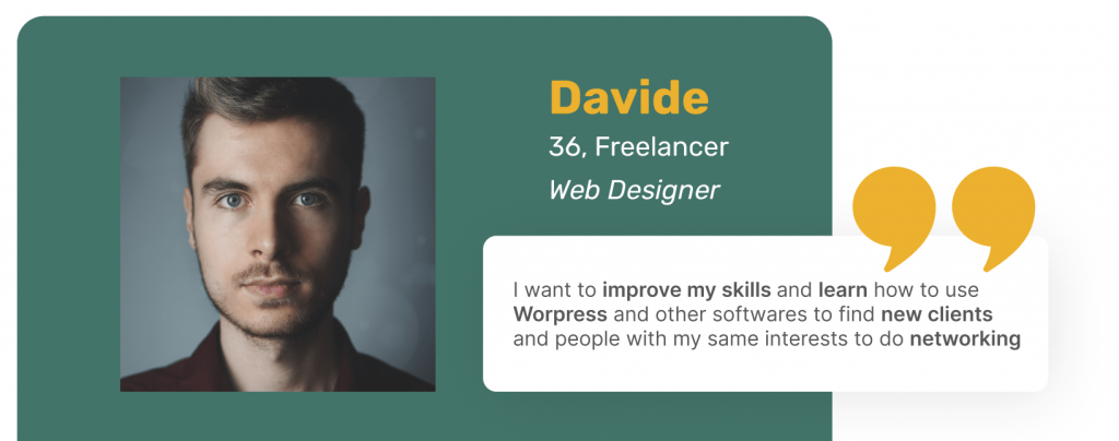
Let me introduce you the user persona: Davide. He is a 36 years old freelancer, currently working as Web Designer for different small companies.
Davide has a goal, he wants to improve his skills and learn how to use WordPress and other softwares to find new clients and people with my same interests to do networking.

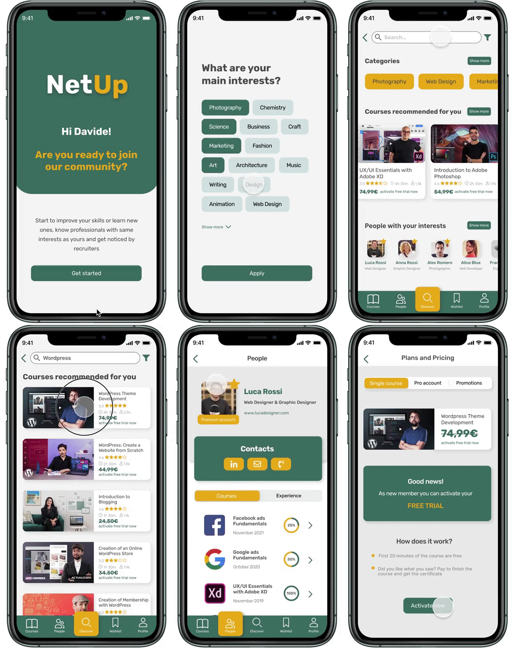
The solution is NetUp! A community where users can learn new skills and show their improvements with the others, meet people with the same interests and get noticed by recruiters

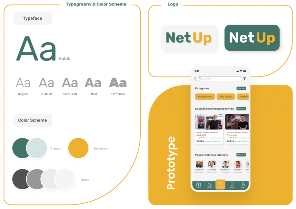
Here you can see the color palette I selected after a few tries and how it was applied to the prototype and logo

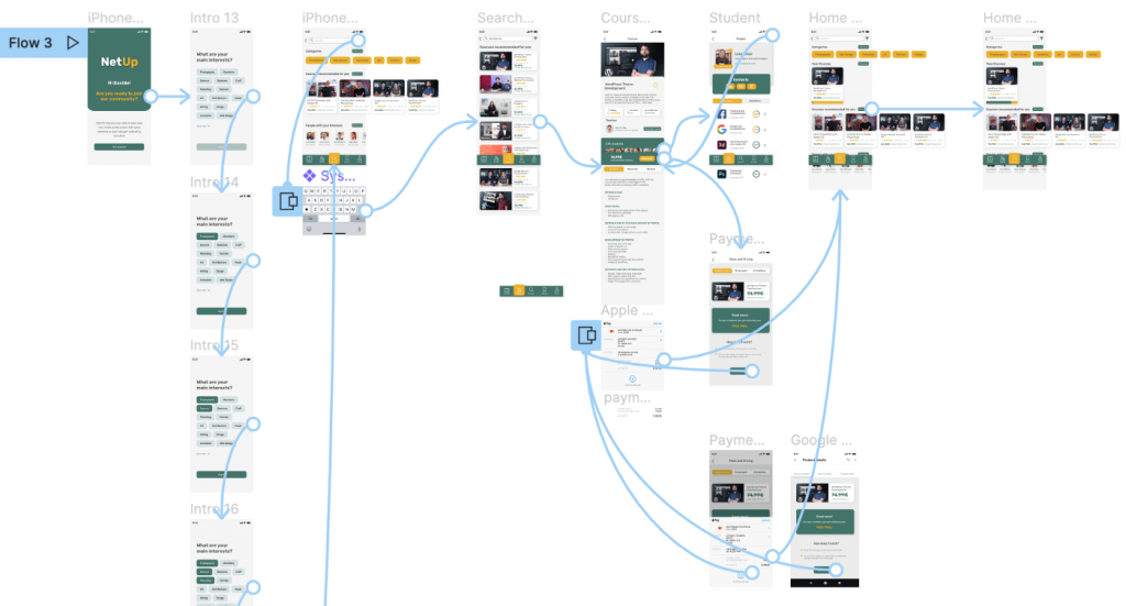
When I had clear the problem and my users needs I started to sketch, prepare a mid-fi prototype and test, again and again. I did two rounds of tests that led me to the final results of my high-fi prototype


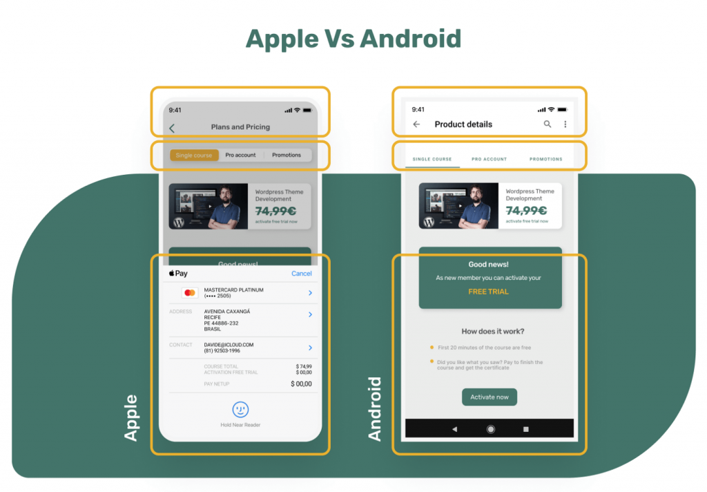
As I mentions before the app was design both for Apple and Android but the prototype that you just saw is Apple friendly. So let me show you the changes that I made to launch the app in Android

The header of the app and menu bar changed to fit the Android patterns and for sure in Android devices ApplePay will be deactivated.
It was a long process the one that led me to the final product that you just saw. I made lot of variations and iterations. Let me explain you the 2 main changes that I made:

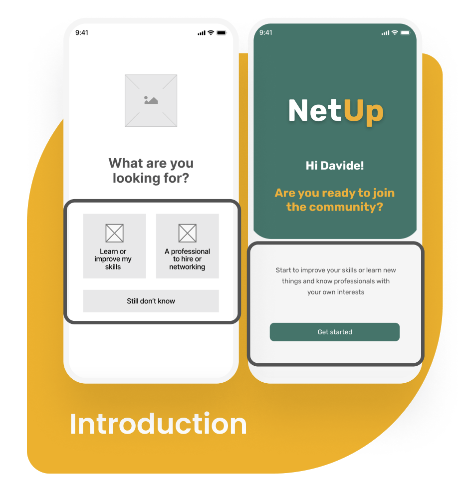
The first main change you can see is in the welcome screen of the app. In my first sketches and digital prototypes I thought it was important to give the users the possibility to choose what they will be doing in the app: learn or improve their skill or look for a professional to hire and networking.
Then usability testing helped me to understand that this question confused the users instead of clarify what they will do throw the app. So as you can see in the final screen I removed the selection.

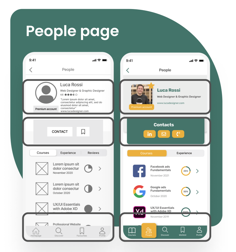
The major change has affected the single people page. As you can see in the first mid-fidelity prototype I designed the rating for professionals. Then thanks to testing I realized that it was not a feature that users will use and they were also confused about how to evaluate someone, by what criteria.
I also added more options of how to contact the professional: LinkedIn, email or phone.
Finally I added another icon in the menu bar to split courses and people pages.

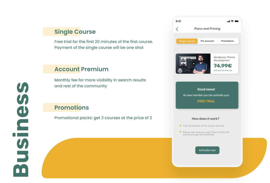
As I said before one of my goals was to generate revenue through the products so I developed 3 different payment options. One for the single course, one for promotions and the last one for premium account

I would like to continue to improve my product and to do so this are the main things that I would like to do:
If you arrived till here reading...